PHOTOGRAPHY + DESIGN by MYRA EDITH
Created in Adobe Photoshop
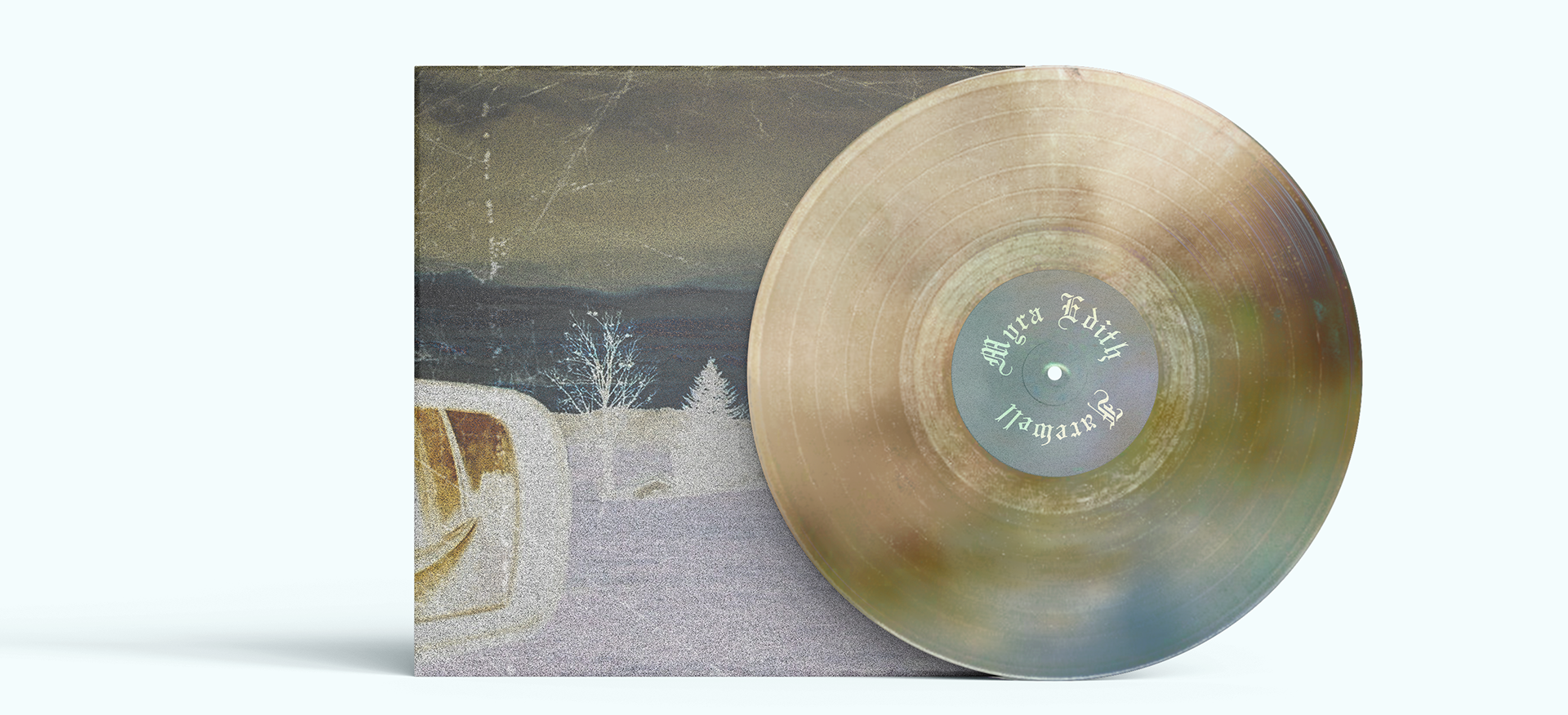
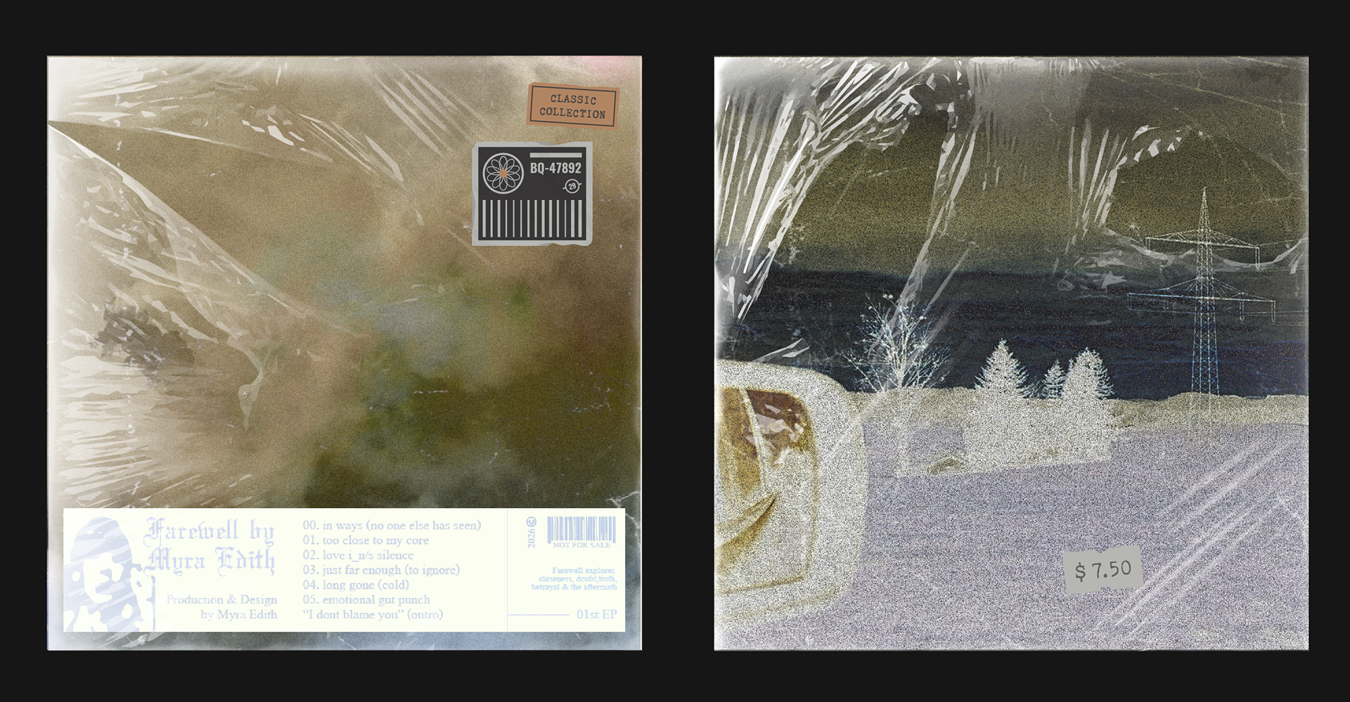
M0CK-UP in Adobe Illustrator + Photoshop
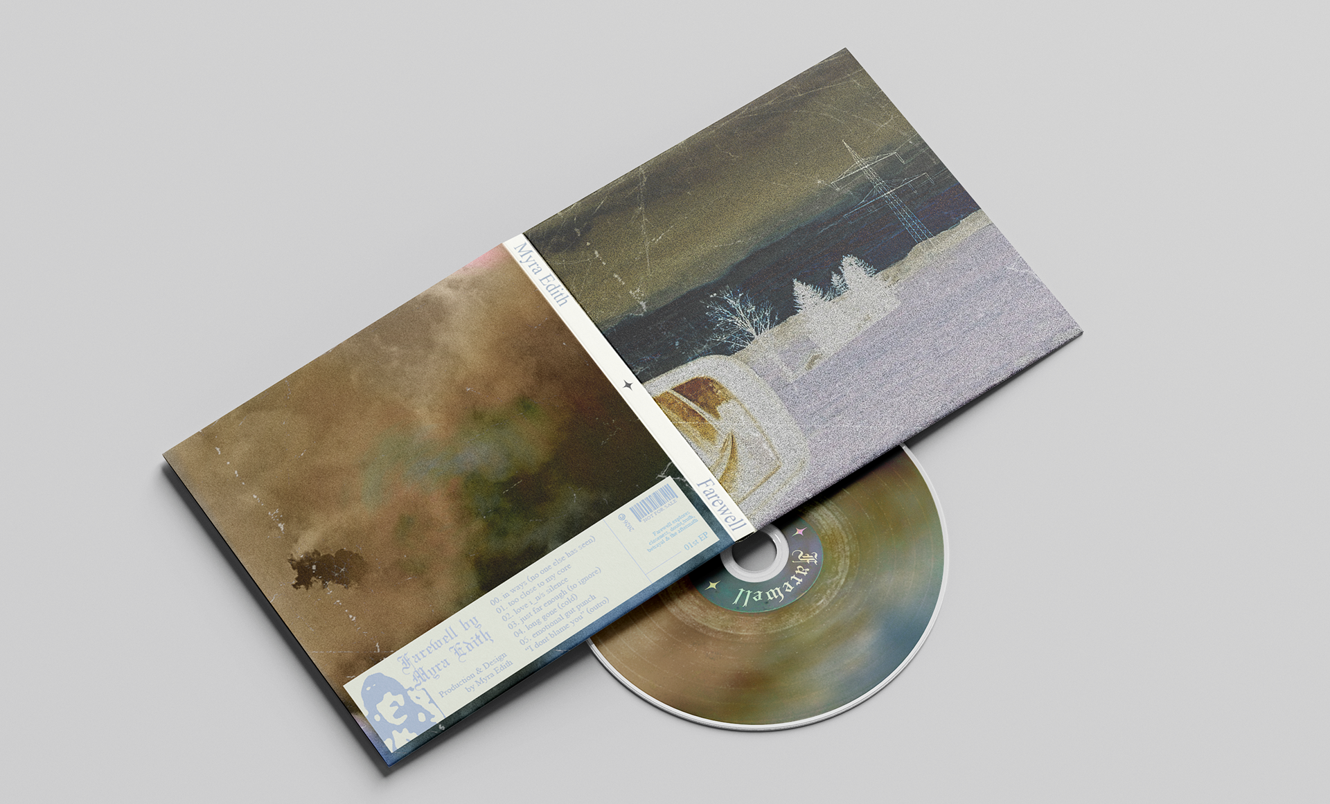
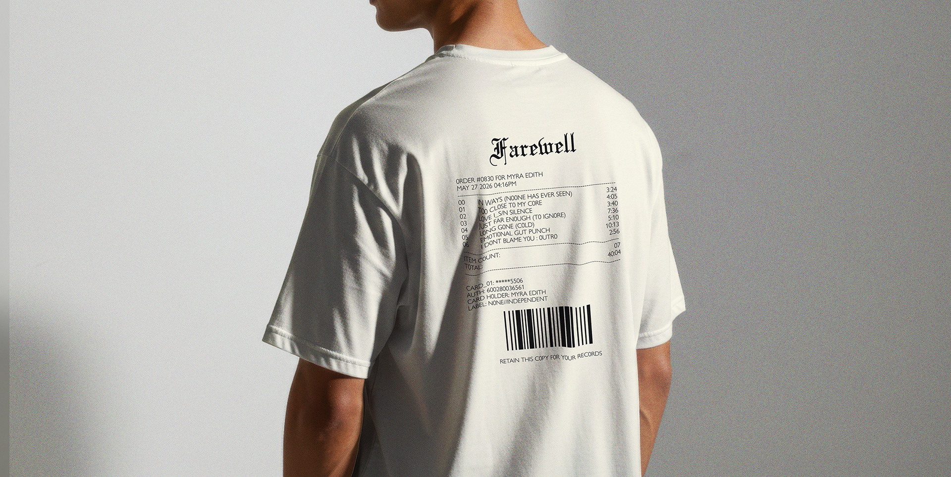
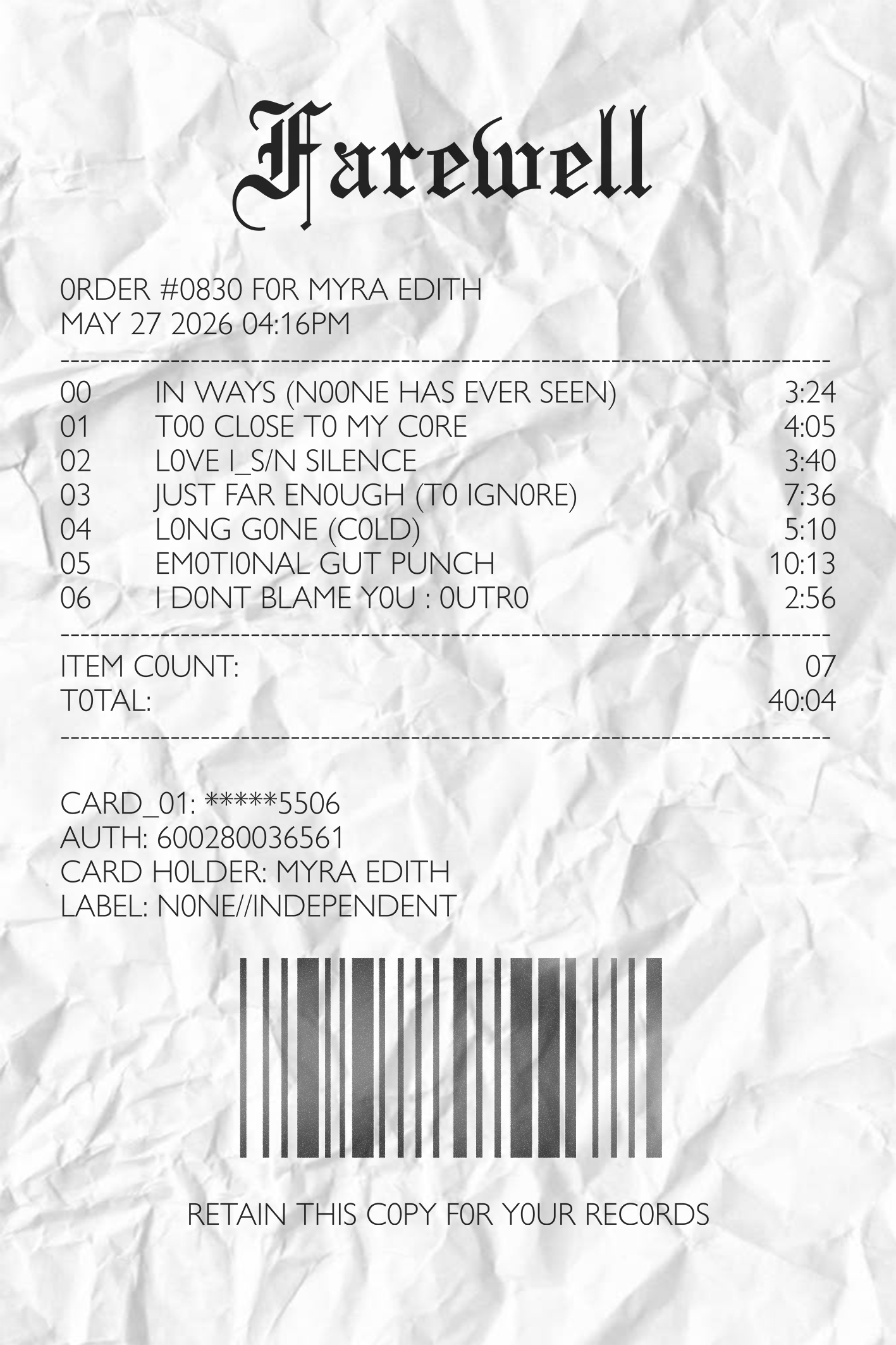
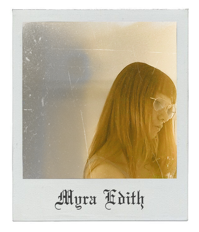
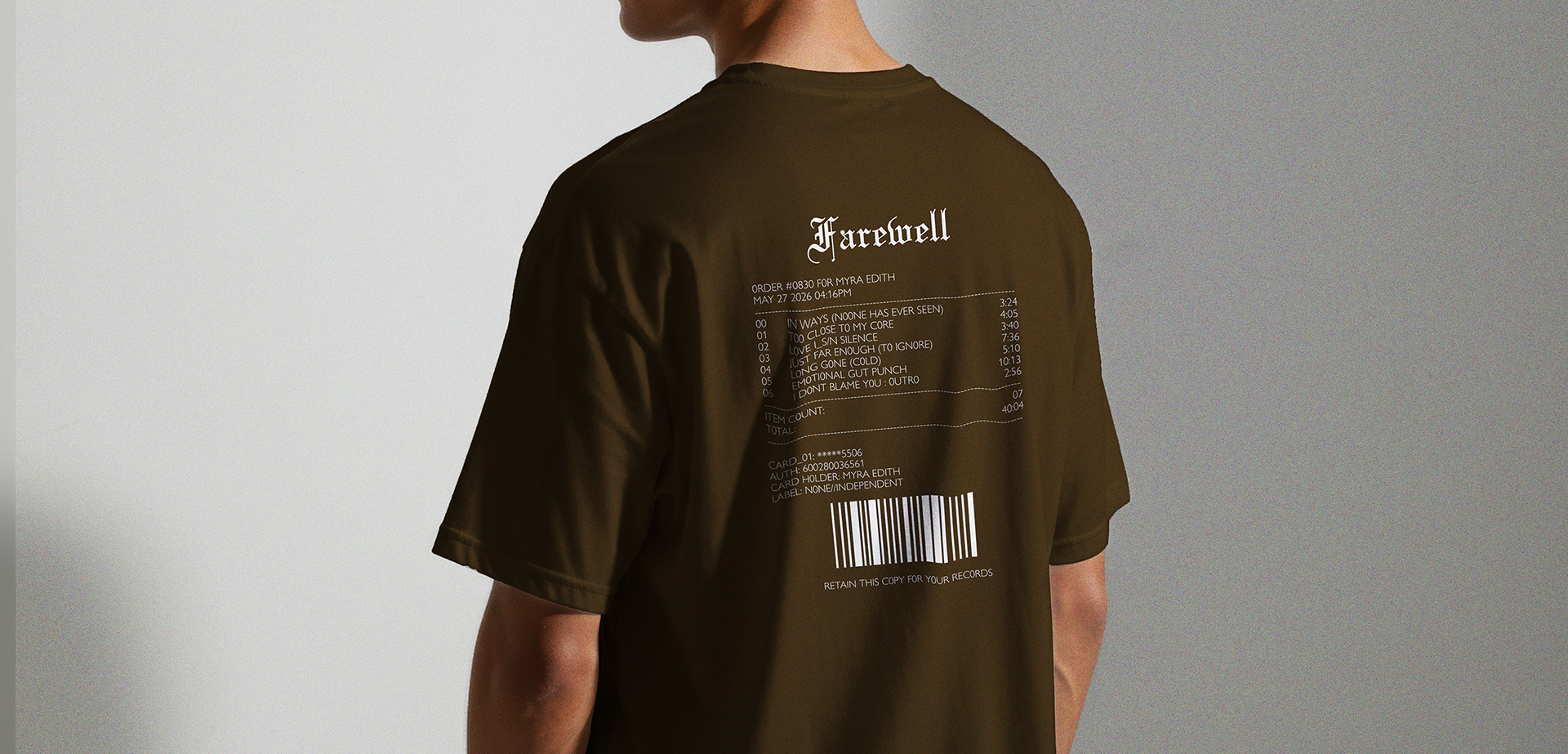
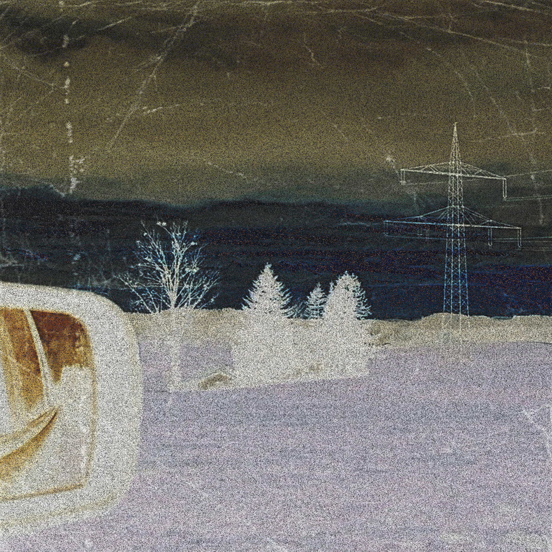
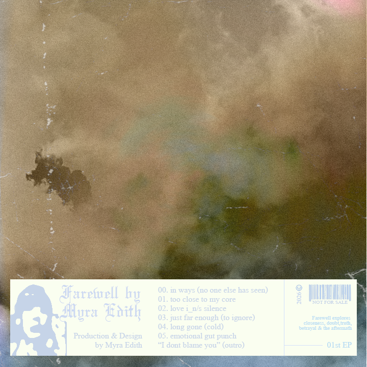
Concept Design Work for an Album titled "Farewell" in a southern gothic ambient folk style
For this I used old Photographs I took myself and layered + textured them to give the designs a retro /aged look and feel. Additionally I used warmer earth tones and contrasted it with softer cooler blue tones.
This Design Pack includes a Vinyl and CD cover + disk design, 2 merch designs (a light + dark version) as well as two goodies in the form of a tracklist-receipt and a sepia style polaroid.
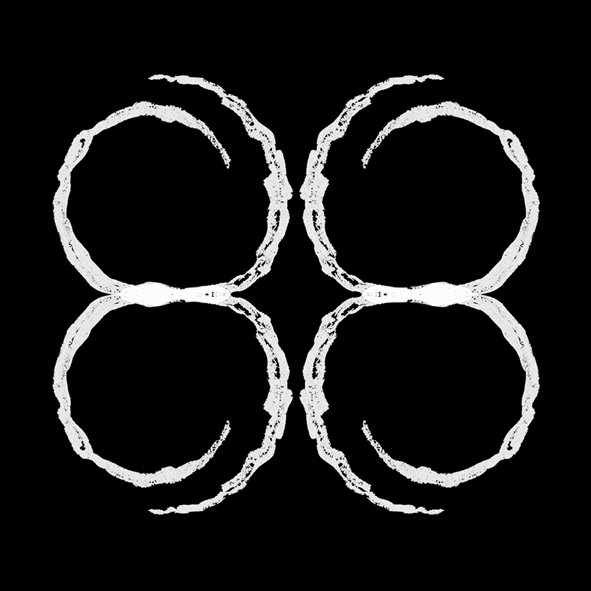
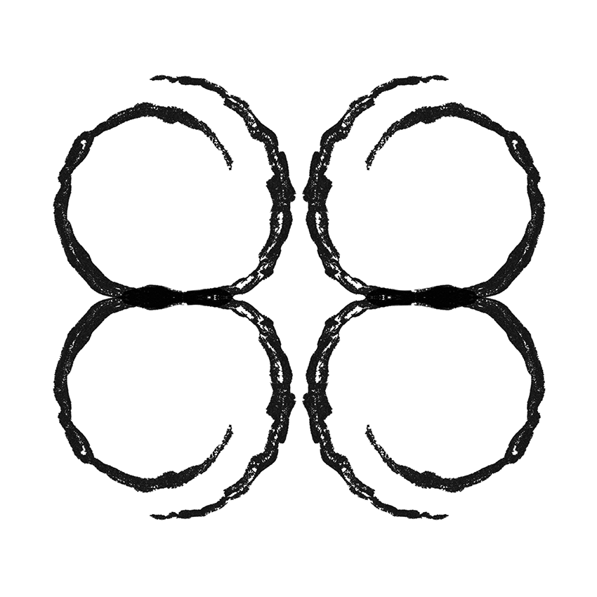
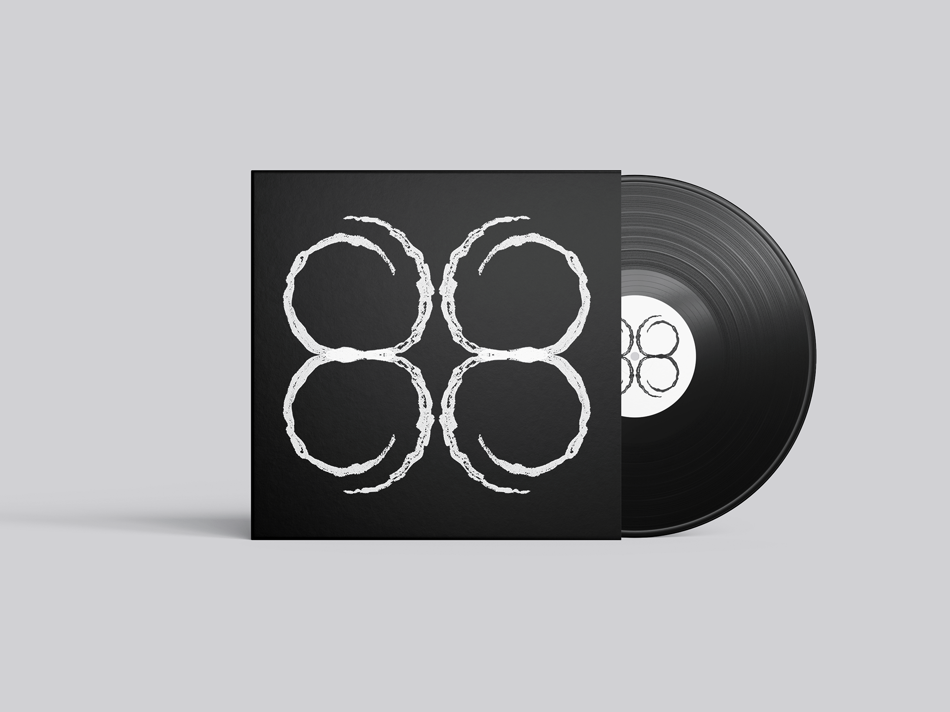
(Mixed-Media) DESIGN by MYRA EDITH
Black & White Version of the Cover Art
Created by hand/analogue + Adobe Illustrator
MOCK-UPs in Photoshop
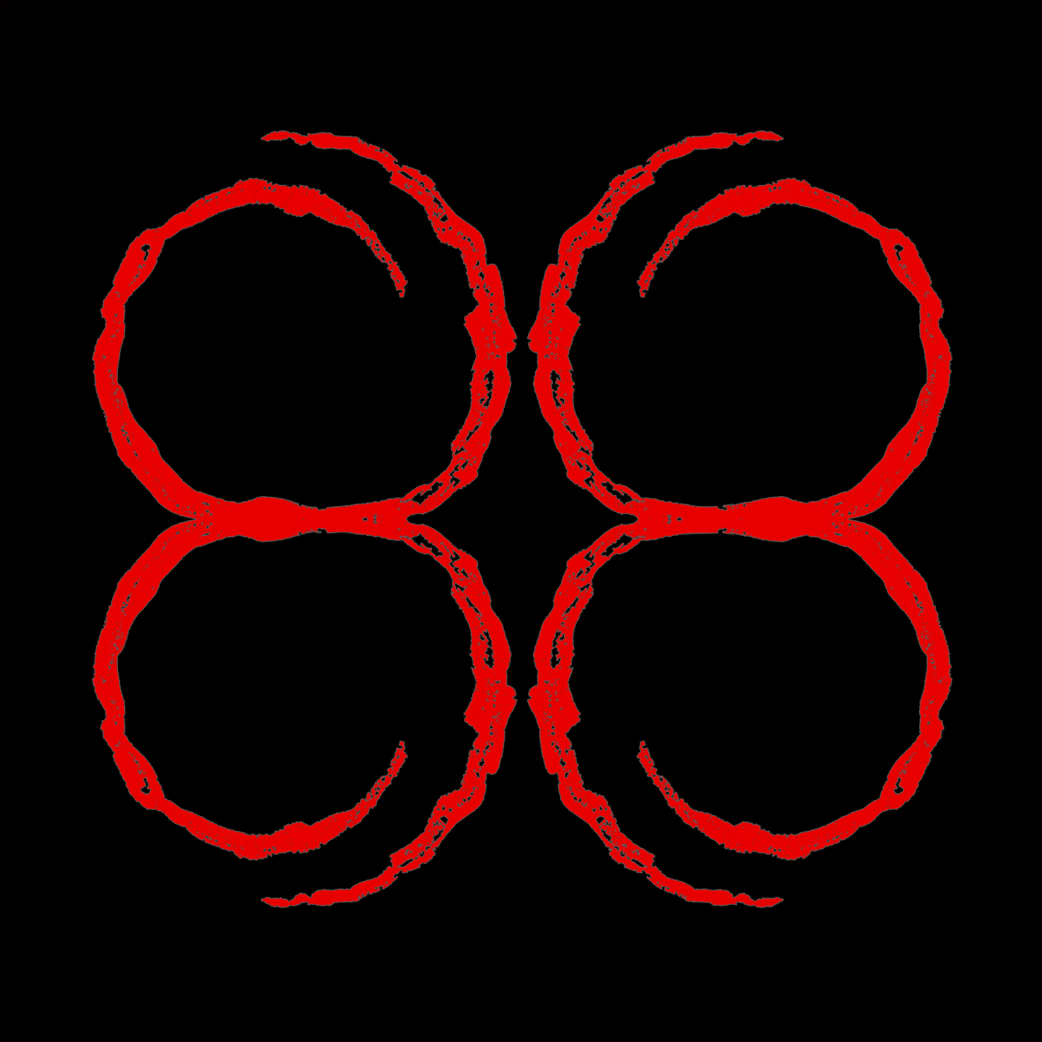
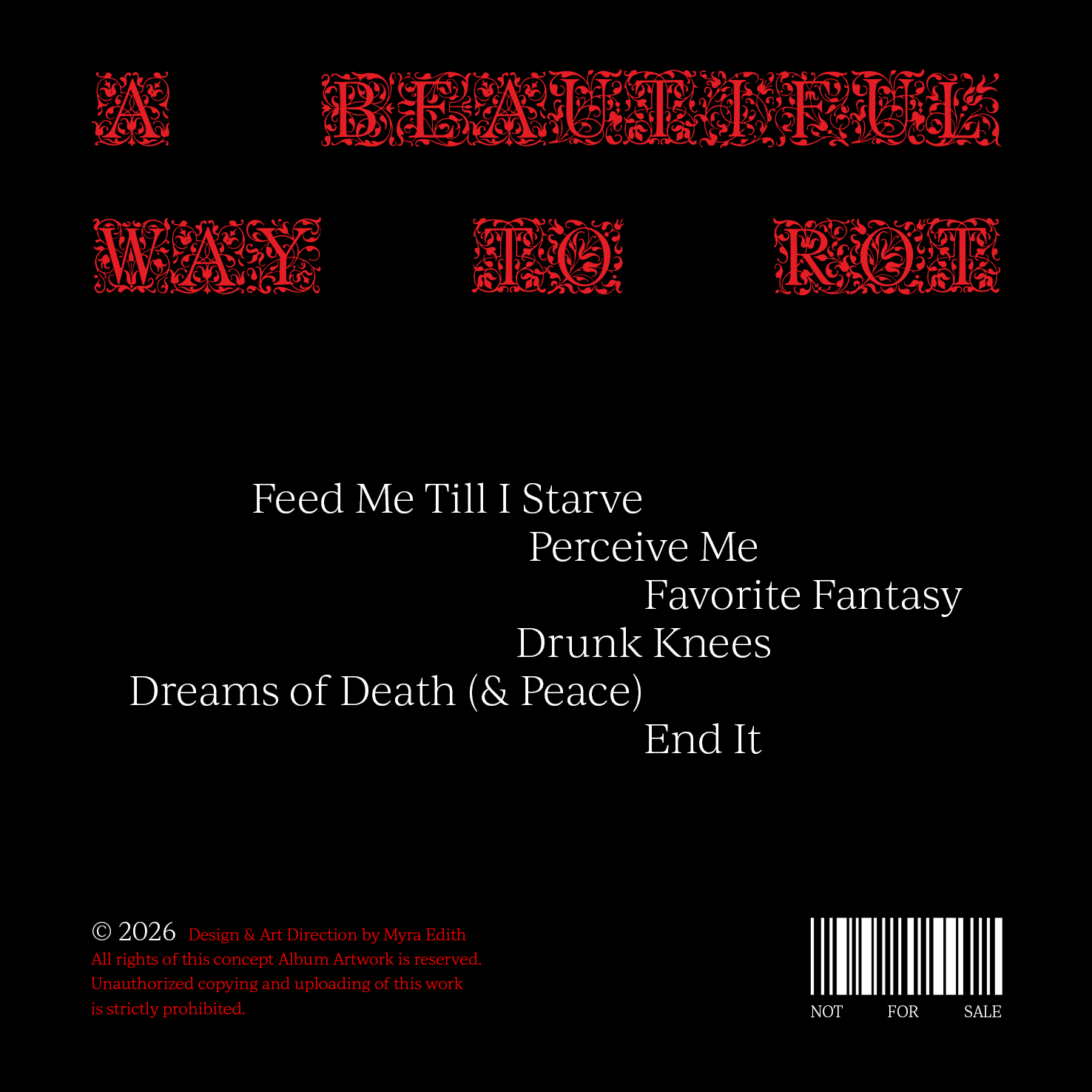
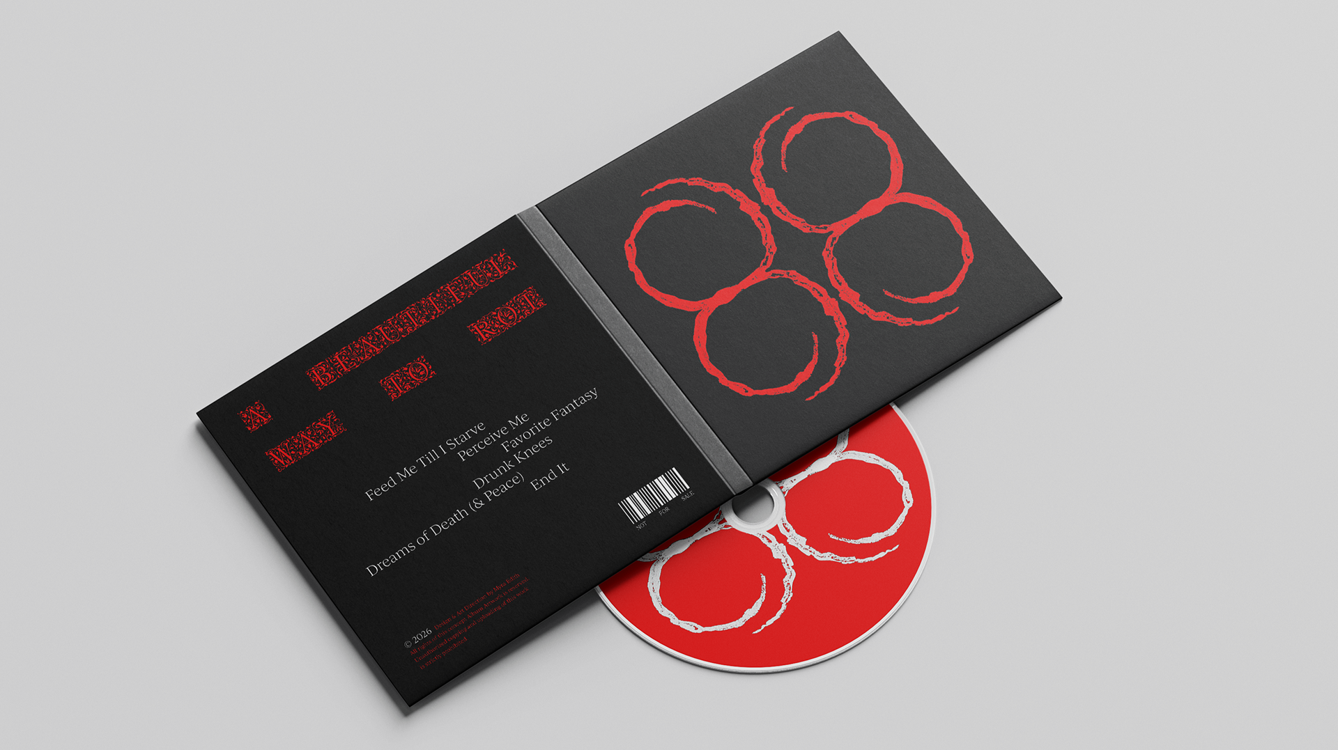
Concept Design Work for an Album titled "A Beautiful Way To Rot"
For the final Design, I used white and a lighter red to contrast the black base of the album cover.
The design on the front cover and the CD is designed entirely by me.


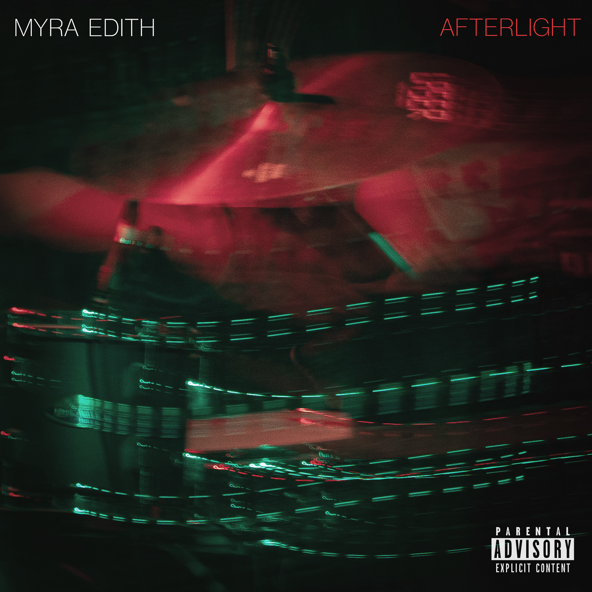
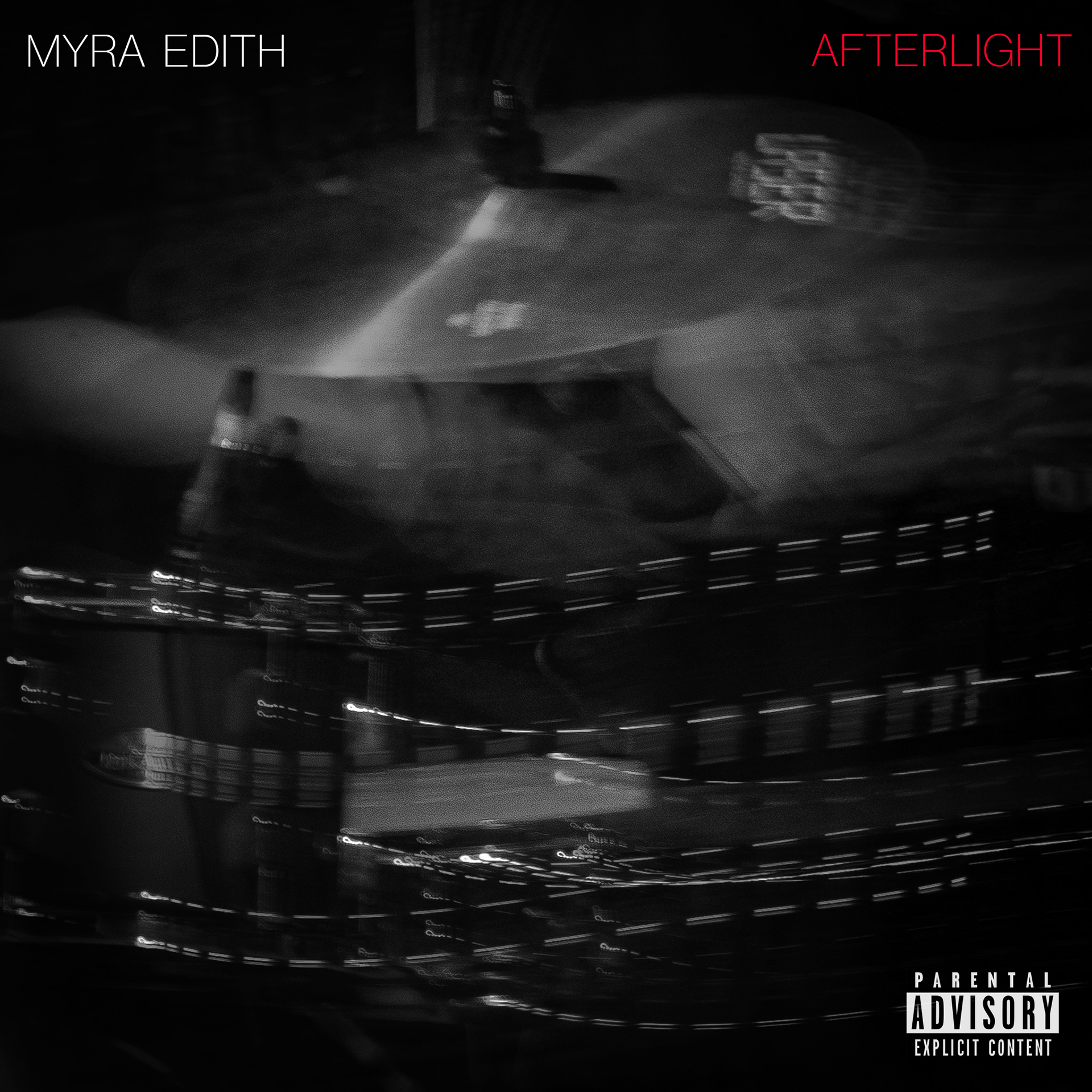
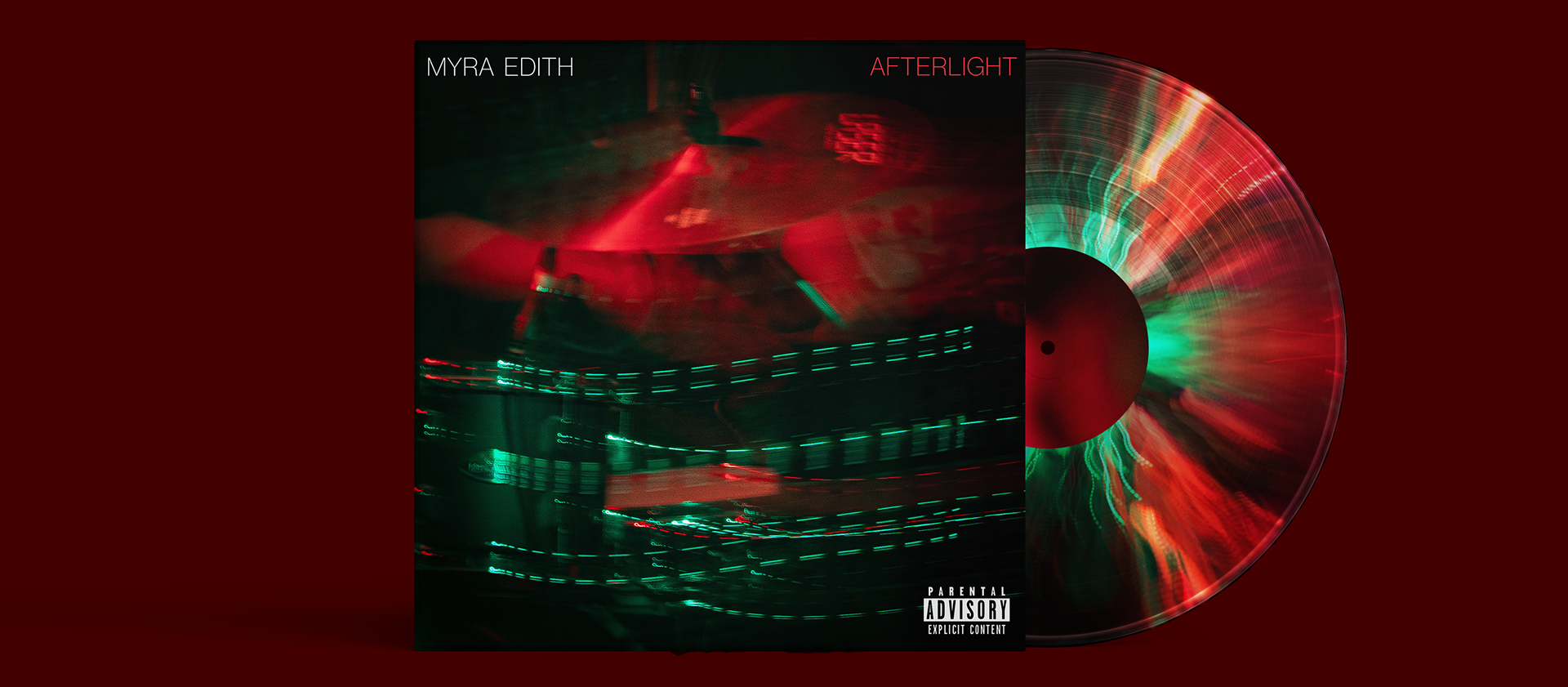
Concept Design Work for an Album titled "Afterlight"
The album's visual aesthetic is characterized by long-exposure light trails in red and green that were created by camera movement. The photograph of cymbals used in this design was taken by me at a local gig. This look uses dark textures mixed with highly saturated reds and greens that complement each other and create a late-night melancholic vibe.
I created 4 different Versions for this front cover: the saturated red-green one that keeps the original colors of the photograph as well as a pink, faded and B-W Version.
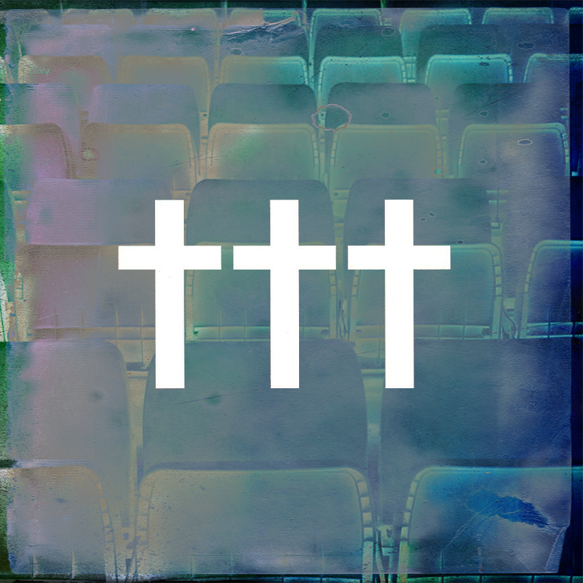
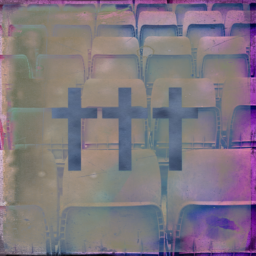
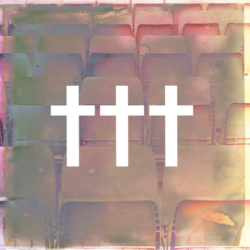
Concept Design Work for an Album by Crosses (†††)
The image is layered with distressed textures, subtle film grain and chromatic color shifts to create the impression of a faded photograph that has been repeatedly archived, scanned and rediscovered. The muted palette of cool blues, purples, soft pinks and warm creams evokes a dreamlike atmosphere that balances melancholy with nostalgia.
I created three different versions of this cover, each emphasizing a different emotional tone. The blue-green version conveys a colder nocturnal mood, the muted purple version focuses on faded nostalgia and memory, while the warm cream and pink version introduces a softer more hopeful atmosphere without losing the overall sense of stillness and isolation.
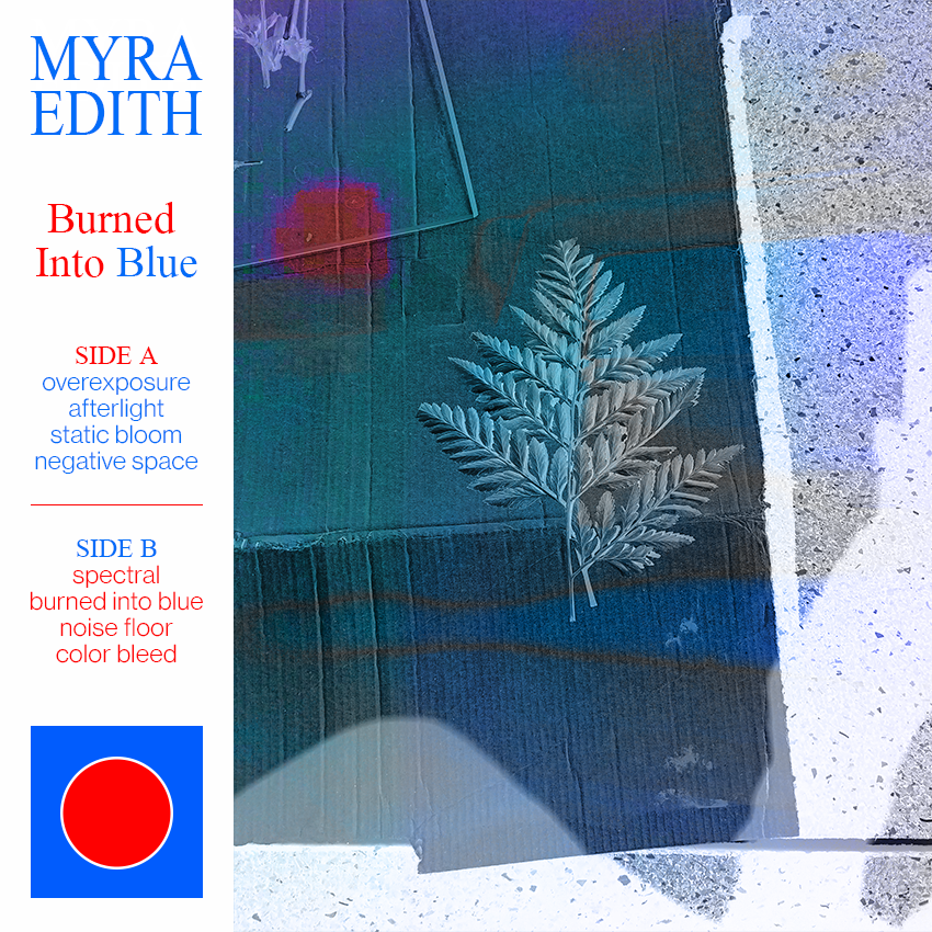
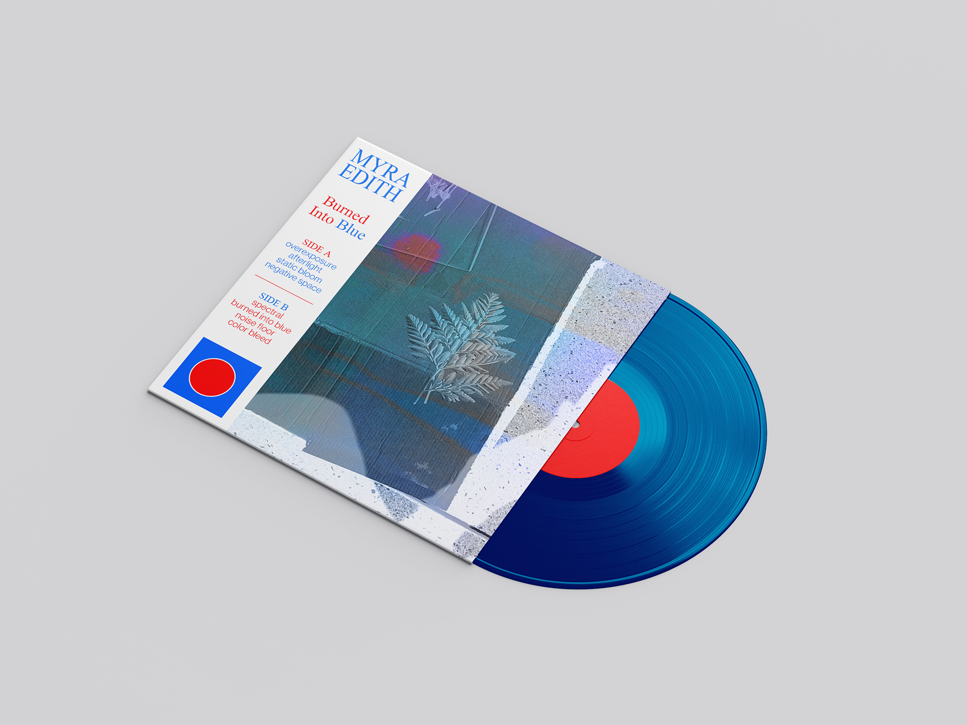
Concept Design Work for an Album titled "Burned Into Blue"
This album cover combines an experimental image of a fern with inverted colors, film grain and subtle light leaks that was achieved by layering and texturing several photographs I took myself.
The design features a restrained palette of deep blues, cyan and a saturated red that create a colder atmosphere while emphasizing themes of memory, decay and preservation. The rather minimalistic typography as well as the vinyl packaging were designed to complement the photographic aesthetic.